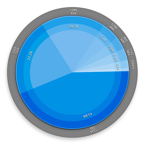
I was a bit bored a while ago, so I thought I’d just try to duplicate how this certain guy made his really cool pie-charts. There were so many comments asking how he did it even if they looked pretty simple to do (aside from having to actually conceptualize them of course). I even ended up making a template for it – for when I’ll use it (of which I have no friggin’ idea hahaha). In any case, just like the original guy did, I took information of visitors’ browser resolutions 1 I guess for the image to have some value however small – to prove that my decision to abandon 800×600 was the correct choice. from Mint’s Agent 007 pepper 2 A Mint plugin is called a “Pepper.”. I just did one chart though, since it was time consuming.